
Position Green offers a broad ESG platform covering everything from carbon management and mandatory reporting to supplier management and group reporting, across multiple regulatory frameworks and industries. Their website had grown organically over the years and no longer reflected the depth or structure of the product in a clear way.
I was brought in as an embedded designer through Taylerd, working alongside Position Green's Web Manager and an external developer one day a week. My role was to redesign the site's most important pages and build out the design system to support future growth. To do that well, I needed to understand the platform deeply enough to communicate it to potential customers.
The work was structured around a priority list rather than a single big redesign. Page by page, we worked through the site's most critical areas: homepage, core feature pages, use case pages, navigation, conversion flows, and content templates.
Before designing anything, I spent time getting to know Position Green's platform properly. The platform covers core capabilities like data management, controlling & audit, embedded AI, benchmarking, materiality assessment, and integrations, and then branches out into specific use cases, industry solutions, and regulatory frameworks (CSRD, ESRS, VSME, EU taxonomy, and more). There's a lot going on.
Even though my scope was the marketing site, not the product itself, the work required a solid understanding of what the platform actually does. I needed to know which capabilities are most relevant for which audiences, and how frameworks and industries relate to the feature set, in order to design pages that communicate the product clearly. That understanding ended up shaping pretty much every design decision that followed.
The biggest challenge was making a complex product feel easy to navigate. Position Green's platform serves multiple audiences (sustainability managers, CFOs, compliance teams), and they're all looking for different things.
I designed a navigation system with two main entry points: Platform, organized by core capabilities on the left with corresponding use cases on the right, and Solutions, organized by regulatory frameworks on the left with industries on the right. The idea was to let users navigate either by what they need to do or by their specific context, without forcing them down a single path.
Each entry point leads to dedicated pages with consistent but flexible templates. That created a clear hierarchy from overview to detail, while keeping the navigation intuitive even as the site grows.

I worked within Position Green's existing design system, but ended up expanding it significantly. Most of the components I designed were new, while some were evolutions of what was already there. The goal was to clean things up, simplify the visual expression, and make the system flexible enough to scale.
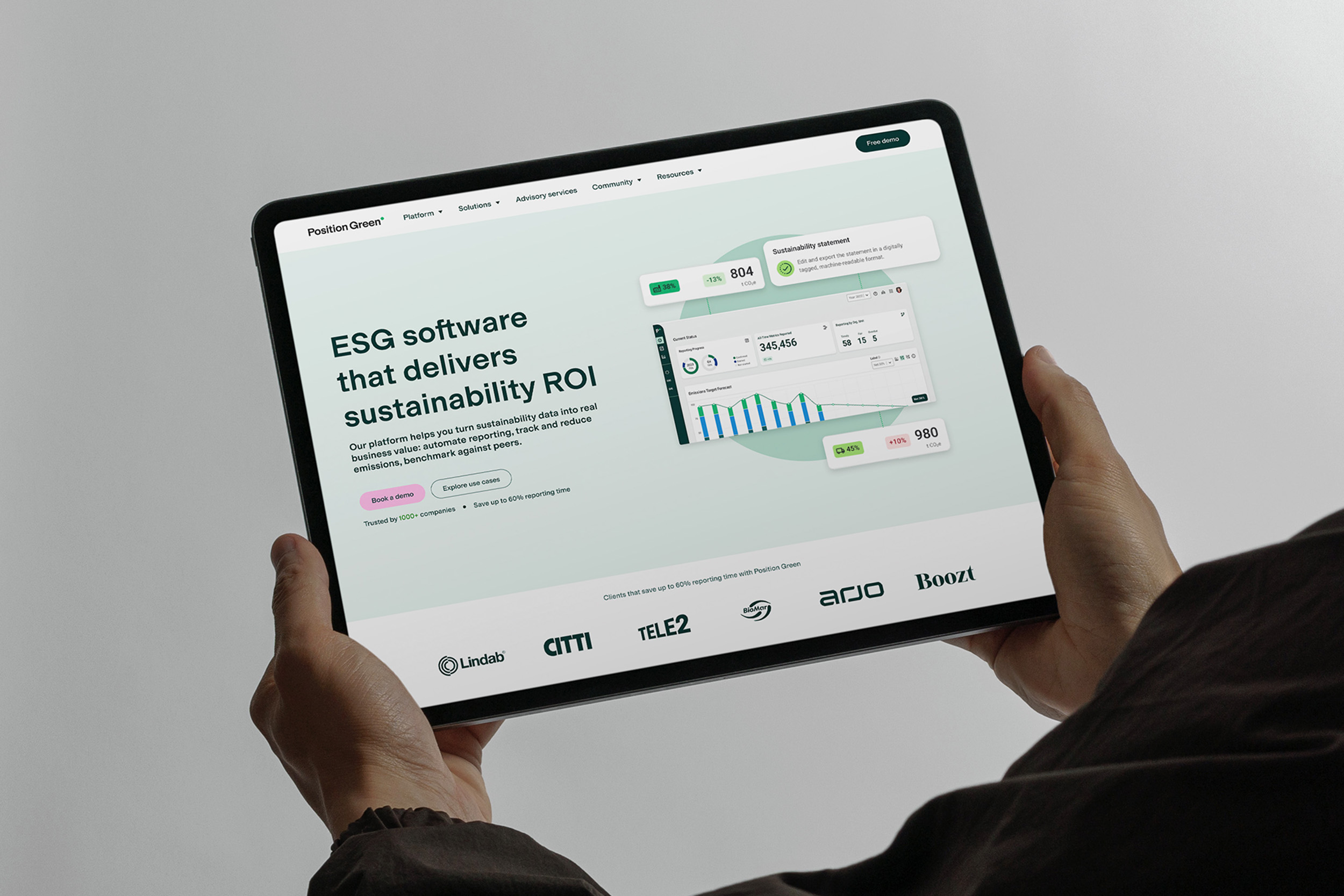
Page templates. I designed reusable templates for the site's key page types: core feature pages (structured around product UI, feature breakdowns, social proof, and FAQ), use case pages (structured around user pain points and outcomes rather than features), and content landing pages for downloadable guides and resources.
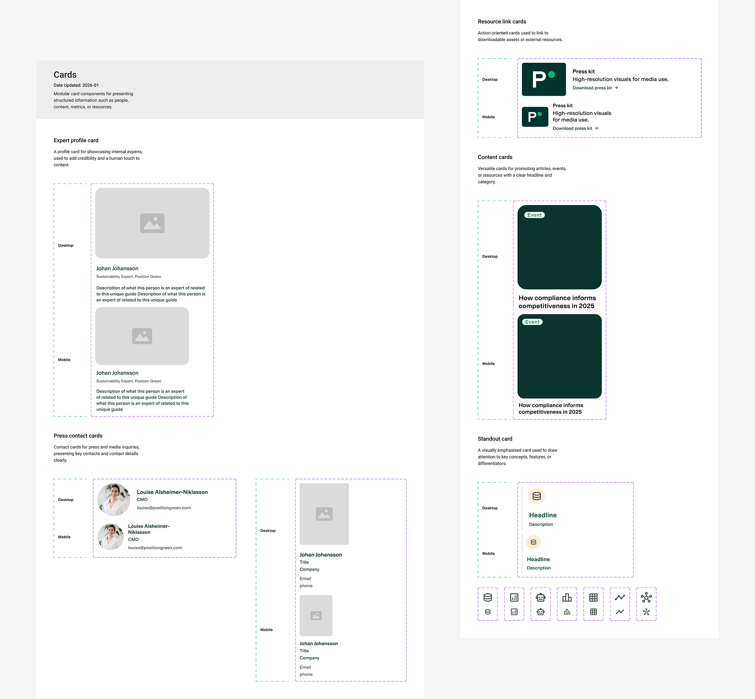
Cards. A big part of the system. I designed nine card types including guide cards, feature cards, use case cards, team member cards, customer rating cards, metric cards, newsletter signup cards, and press release cards, each with multiple variants for different contexts.
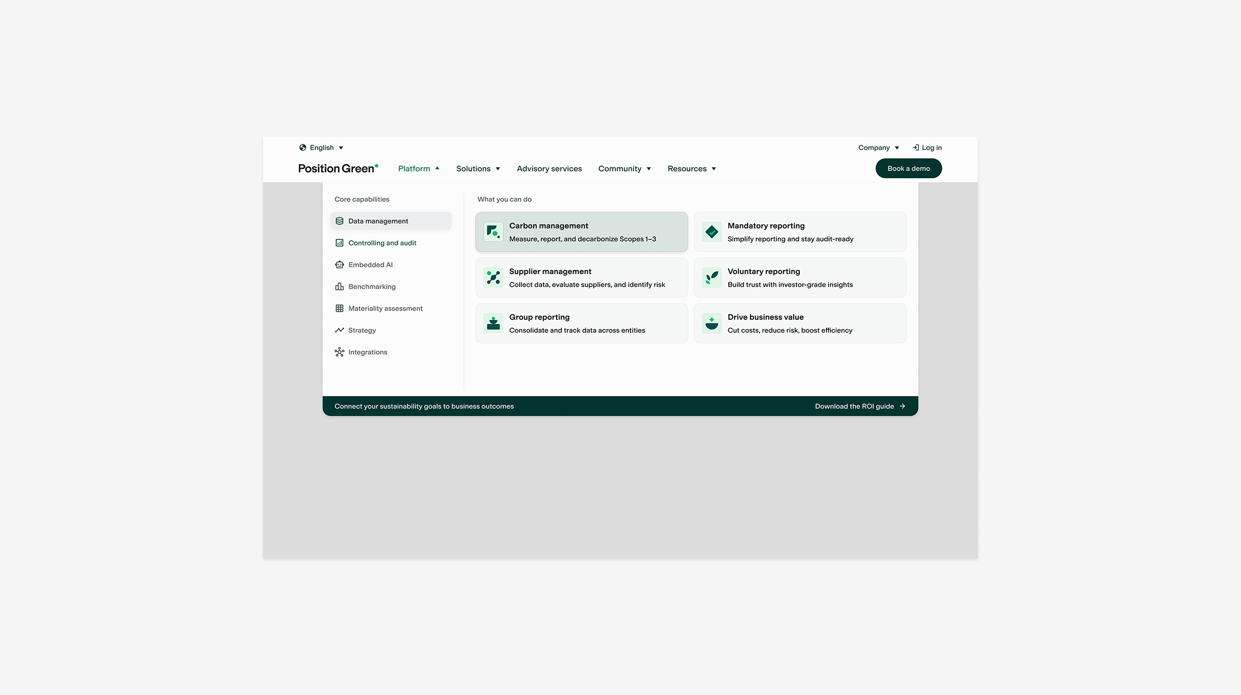
Navigation. The full responsive mega menu system across desktop, tablet, and mobile, with utility bar, dropdown structures, hover states, and icon system. Probably the most complex component in terms of states and breakpoints.
Testimonial and social proof. Multiple variants ranging from a simple inline quote to a featured testimonial with video and client logo. These show up across the whole site in different contexts, so they needed to be flexible while still feeling consistent.
Content sections. Flexible layout sections for structuring page content: split content blocks with image orientation options, CTA sections with multiple states, and responsive testimonial sections.
Supporting components. Headers, chips, badges, list items, and other smaller building blocks that tie the system together.


Every page needed a clear purpose: moving sustainability professionals from awareness to action. I designed contextual CTAs throughout the site, dedicated landing pages for guides and resources, and the demo booking page.
Over the course of a year, I designed the site's key pages across desktop, tablet, and mobile breakpoints. The delivery included a restructured information architecture, page templates for the most important page types, and a significantly expanded component library with cards, navigation, testimonials, content sections, and conversion modules.
All designs were delivered in Figma and built by the external developer in Position Green's CMS.